
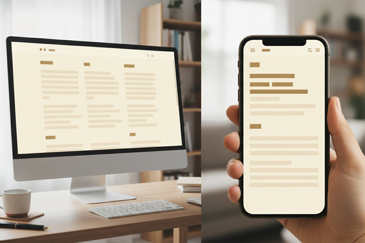
Typography is one of the most important parts of a readable blog, yet it is often treated as an afterthought. The right font choices can make a site feel calmer, more polished, and easier to use. On a minimalist blog, typography does much of the visual work, so it needs to support both clarity and style.
The first priority is legibility. Readers should not have to slow down to decode the text. Clean letterforms, adequate spacing, and a comfortable size all contribute to a smoother reading experience. If the font feels too decorative or too cramped, the content becomes harder to absorb. Good typography removes effort rather than adding to it.
Line length also matters. A page that is too wide can make reading tiring, while a layout that is too narrow can feel choppy. The best balance creates a natural pace that works across screen sizes. This is especially important on a blog where the article itself is the main product.
Strong typography also supports the personality of the site. It can make a blog feel thoughtful, modern, or quietly confident without needing extra visual decoration. When paired with simple spacing and a restrained color palette, it gives the entire site a cohesive tone. For readers, that means less distraction and more enjoyment with every post.
Leave a Reply