
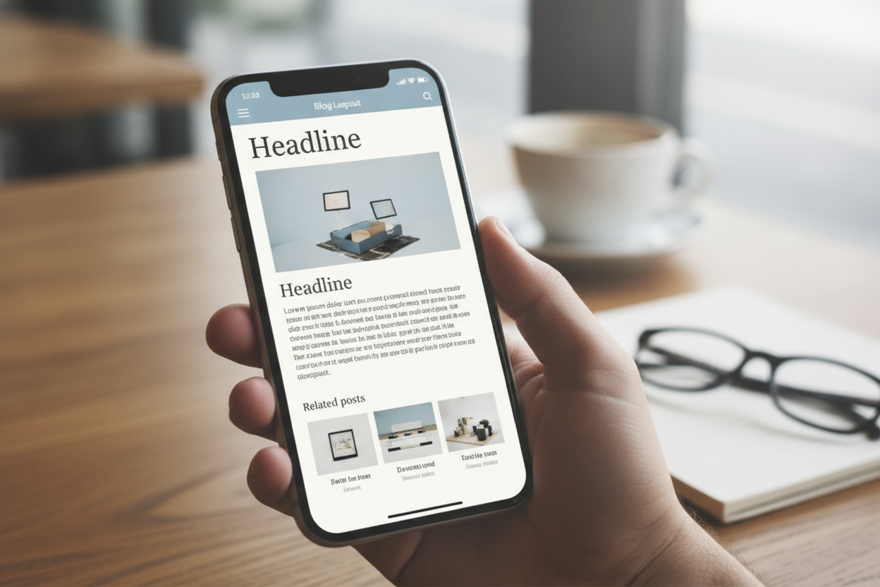
A mobile-first layout is no longer optional for most blogs. Many readers will discover your site on a phone, and their first impression depends on how easily they can move through it. A layout that feels clean on mobile usually feels clean everywhere else too. That is one reason minimal design works so well for personal blogs.
On smaller screens, spacing becomes critical. Text needs room to breathe, buttons should be easy to tap, and navigation should remain obvious without taking over the page. If the design is crowded, readers have to work harder just to start reading. A mobile-first approach removes that friction and keeps the experience focused on the content.
Typography also plays a larger role on mobile. Fonts should be legible at a glance, with a line length that supports comfortable reading. The article itself should be the main event, not the interface around it. When a post page is built around text clarity, visitors can move through the content with less strain and more enjoyment.
For a fast-loading blog, mobile-first thinking also encourages better performance choices. Slimmer layouts, simpler templates, and fewer unnecessary elements usually lead to quicker pages. That makes the site feel more modern and respectful of the reader’s time. A well-made mobile layout is not just convenient. It is part of a better overall blogging experience.
Leave a Reply