
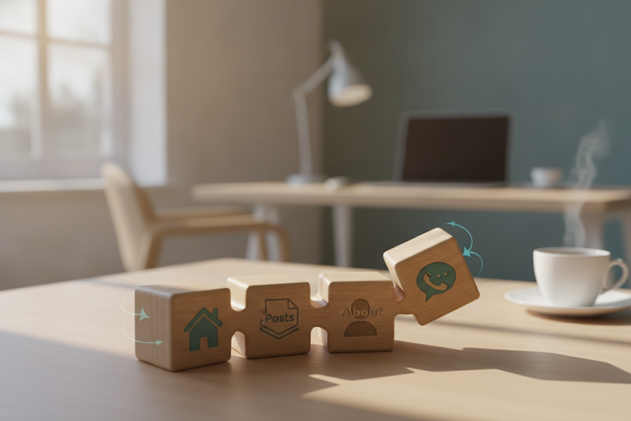
Simple navigation is one of the best gifts you can give your readers. When the path through a blog is obvious, visitors spend less time searching and more time reading. For a site like Cointhread, a small set of clear links is usually enough. Home, Blog or Posts, About, and Contact cover the essentials without adding clutter.
Good navigation should feel present but unobtrusive. It should help readers find their way without competing with the article they came to see. That balance is especially important on a content-first site, where the design should support the writing rather than distract from it. If the menu is too complex, the experience starts to feel heavier than it needs to be.
Consistency also matters. The navigation should appear in the same place across the site, so readers always know where to look. On mobile, it should remain easy to access without dominating the screen. A simple menu is not a limitation. It is a usability advantage because it reduces choice overload and keeps the site calm.
When navigation is done well, the blog feels more trustworthy and easier to return to. Visitors can move naturally from one post to another, learn more about the site, or get in touch without confusion. That ease of movement supports everything else your blog is trying to do.
Leave a Reply