
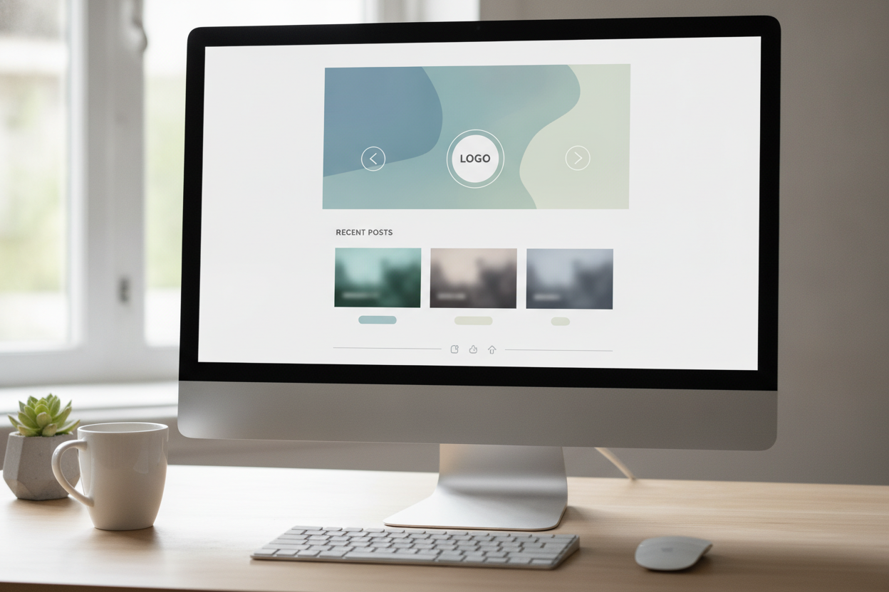
A clean homepage should answer three questions quickly: what the blog is about, what to read next, and how to keep exploring. For Cointhread, that means a short introduction, a clear list of recent posts, and simple navigation that never competes with the content. When those pieces are organized well, the homepage feels calm and useful.
Too many homepages try to do too much. They add large sliders, multiple calls to action, or long blocks of unrelated text. A content-first approach works better for a personal blog because it lets the writing take center stage. Readers should be able to scan the page in a few seconds and understand where to begin. That kind of clarity creates a better first impression.
Visual hierarchy matters here. The blog name should be easy to spot, the introduction should be short, and the post list should be the most obvious feature on the page. If a visitor lands for the first time, they should know instantly that the site is built for reading. That sense of purpose makes the design feel intentional rather than empty.
A well-designed homepage also supports mobile use. With a smaller screen, simple layouts become even more valuable. A compact structure, generous spacing, and readable text help the page feel effortless. The best homepage for a lightweight blog is one that welcomes the reader, then gets out of the way.
Leave a Reply