
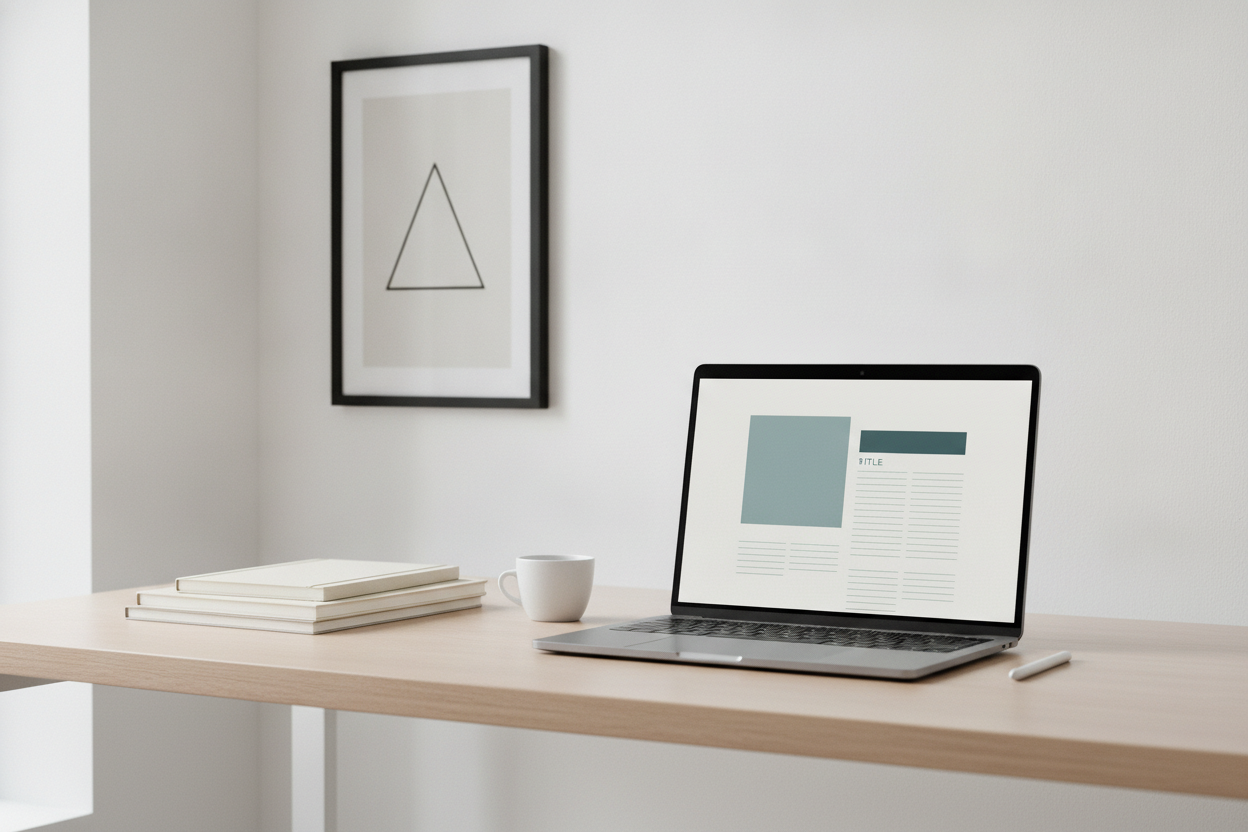
A minimal blog design does more than look clean. It helps readers focus on the words, moves attention to the content, and makes the entire experience feel faster. For a personal blog like Cointhread, that matters because visitors usually arrive to read a post, not to browse a crowded interface. A simple layout with generous spacing, clear typography, and a limited color palette supports that goal beautifully.
When you remove visual noise, you also reduce friction. Readers can find recent posts quickly, scan titles more easily, and move between pages without wondering where to click next. That kind of clarity builds trust. It also works well on mobile, where small screens make clutter feel even heavier. A restrained design often performs better because it loads faster and adapts more gracefully to different devices.
Minimalism does not mean boring. It means every choice has a purpose. The homepage can introduce the blog in one short paragraph, show a handful of recent posts, and leave room for breathing space. Post pages can use strong typography, comfortable line length, and simple navigation so readers stay immersed in the article. Even small details like consistent spacing and subtle links help create a polished experience.
If you want your blog to feel modern and enduring, start by editing out the unnecessary. Keep the layout content-first, make the navigation obvious, and let the writing lead. That approach creates a site that feels calm, professional, and easy to return to.
Leave a Reply